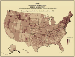
The following teaser is from a fascinating article by Ana Swanson, published June 19, 2015 in the online edition of the Washington Post.
The way that different races and ethnicities are spread around the U.S. says a lot about our history. Some groups ended up in a particular region of the U.S. through the invitation of friends and family; others relocated to a particular place because the timing of their migration coincided with the “opening up” or economic boom of a certain part of the U.S. Of course, other patterns stem from more tragic histories, including the concentration of Native Americans onto reservations and the imprint of slavery in the South.
Nathan Yau, a statistician who runs the blog Flowing Data, has made a series of gorgeous maps breaking down the population of America. The maps are part of his recent project to recreate the 1874 Statistical Atlas of the United States with the original design but 2013 data. Below are 15 of them that illustrate how the U.S. population got here. All of these categories are self-reported; the data is based on what Americans told Census workers about race, ethnicity and background.
